Utilizing Mobile Elements for Simultaneous Task Management
In the digital age, user interfaces play a crucial role in facilitating productivity and efficiency. One design pattern that has gained significant attention is the "movable pieces" design pattern. This approach allows users to customize their interface by dragging, rearranging, and resizing UI components, making it easier for them to multitask and personalize their experience.
Key Approaches to Implementing the "Movable Pieces" Design Pattern
- Modular UI Components (Cards, Panels, or Widgets): Design your UI using independent, self-contained pieces that can be moved, resized, or docked independently. These units can be reordered on a dashboard to prioritize relevant information or workflows.
- Drag-and-Drop Mechanisms: Implement drag-and-drop support, allowing users to click and drag components around the interface. This includes defining drag handles, drag targets, snapping behavior, and layout constraints to ensure components fit well within the UI grid or workspace.
- Accordion or Collapsible Sections: Use collapsible UI sections where pieces can expand or contract as the user needs, helping to manage screen real estate effectively. This approach complements movable pieces by allowing users to focus on important areas and hide less relevant content until needed.
- Docking and Floating Windows: Support the ability for windows or panels to dock (snap to screen edges or other UI areas) or float as independent windows. This is common in operating systems’ window managers and productivity apps to maximize multitasking.
- Responsive Layouts: Ensure the UI adjusts to different screen sizes and orientations. Responsive grids like bento grids provide a structured yet flexible layout system that adapts as users reorder or resize components, maintaining usability across devices.
- Micro-Interactions and Visual Feedback: Incorporate animations or hover effects to provide clear visual cues that items are movable or interactive. For example, cards "jumping" slightly on hover to indicate they can be dragged or clicked.
Implementing in Windows, Mac OS X, or Other OS Environments
Operating systems like Windows, Mac OS X, and others offer native APIs for implementing the "movable pieces" design pattern.
- Windows: Uses native window management APIs that support snapping, docking, and floating windows. Applications can implement custom draggable panels inside these frameworks, such as via Windows Presentation Foundation (WPF) or Universal Windows Platform (UWP) with built-in drag-and-drop support.
- Mac OS X: Offers rich APIs for window and view management. Developers can implement movable panels using NSWindow and NSView classes that support dragging and pinning. The macOS Dock and Spaces also provide multitasking and window organization patterns.
- Cross-Platform or Web-based UIs: Use JavaScript libraries or frameworks that support drag-and-drop (e.g., React DnD, Interact.js) combined with modular card or panel components. Techniques like accordion controls, card UI, and responsive bento grids enable flexible customization in web apps running on any OS.
The Benefits of the "Movable Pieces" Design Pattern
By combining these design components with the OS’s native window and UI management capabilities, developers can create "movable piece interfaces" that enhance customization and multitasking in a way that users intuitively understand and efficiently use. Users become more adept at arranging information and graphical user interface elements to support their needs. The ability to resize and move panels around the user interface can help users improve their productivity, especially when multitasking.
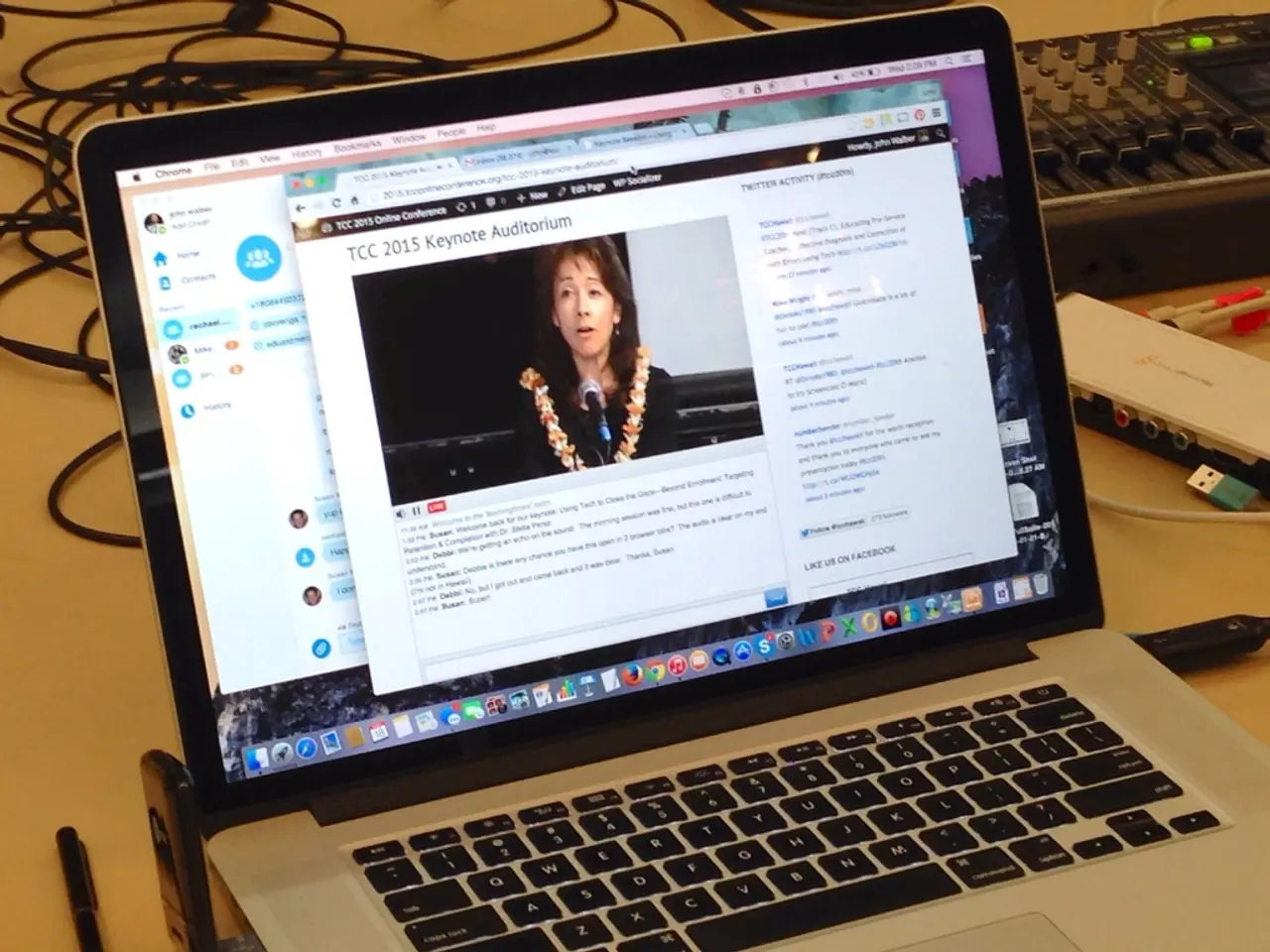
For example, a user might be multitasking, such as watching a streaming movie, relisting eBay items, and drafting an email. With the movable pieces design pattern, they can prioritize their tasks and actions, making their workflow more efficient and enjoyable. Moreover, it is essential to include cues for controlling the panels, such as icons or other indicators, to make the design pattern accessible and intuitive for all users.
The "movable pieces" design pattern is not just for expert user groups; it is crucial for all users who want to personalize their interface and improve their productivity. By providing users with the ability to customize their interface, they can create an environment that suits their needs and workflow, leading to a more enjoyable and productive experience.
- To customize user interfaces and facilitate productivity, developers can employ the "movable pieces" design pattern, which emphasizes modular UI components that users can rearrange and resize.
- Implementing drag-and-drop support is key to this pattern, allowing users to easily move components around the interface by clicking and dragging.
- Accordion or collapsible sections should also be included to help manage screen real estate by allowing users to hide less relevant content.
- Docking and floating windows can enhance multitasking by enabling users to snap components to screen edges or operate them as independent windows.
- Responsive layouts are crucial for ensuring usability across devices, with adaptable grids like bento grids providing a flexible yet structured layout system.
- Micro-interactions and visual feedback offer clear cues to users about which items are movable or interactive, such as cards "jumping" on hover.
- Operating systems like Windows and Mac OS X offer APIs to help implement the "movable pieces" design pattern, while JavaScript libraries and frameworks can be used for cross-platform or web-based UIs.
- By using the "movable pieces" design pattern, users can arrange information and interface elements to better suit their needs, improving productivity and providing a more enjoyable experience.
- This design pattern is not exclusive to expert user groups but is beneficial for all users seeking to personalize their interface for improved productivity.
- The intuitive nature of the "movable pieces" design pattern helps users craft an interface that matches their workflow, fostering a more enjoyable and efficient digital experience on social media, education and self-development, technology, entertainment, and productivity platforms.


